| Professional charting tools for .Net developers |
Introducing SharpPlot
Your First Chart
Recent Updates
Tutorials
General Tutorials
Chart Tutorials
Reference
SharpPlot Class
Properties
Methods
Structures
Enumerations
Style examples
Glossaries
Active Charts
VectorMath Class
DBUtil Class
Get SharpPlot
Download SharpPlot
Buying SharpPlot
SharpPlot Support
Upgrading from GraPL
Release notes
Home > Sample Charts > PieChart > Labelling inside the sectors
Labelling inside the sectors
The Piechart is typically used to show how some total value is divided up, for example sales in two or more regions. It works best when there are only a few values, and they should be ranked in numerical order to facilitate comparison of the sector sizes. This chart complements the political graphic in the Barchart tutorial by showing the percentage of votes cast for each party.
The numbers are written inside each sector here. Obviously, this approach only works if most of the sectors are reasonably large as SharpPlot will simply omit any labels which don’t fit. This pie starts drawing from the 3:00 line (rather than midnight) and uses a thick white edge to give a ‘dissected’ appearance.
Note that SharpPlot does not multiply the values by 100 here – the ‘%’ symbol is treated like any other insertion character and has no special meaning.
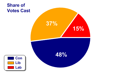
SharpPlot sp = new SharpPlot;
sp.SetMargins(18,24,18,0);

Party = new string[]{"Con","Lib","Lab"};
Votepc = new int[] {48,37,15};

sp.Heading = "Share of\nVotes Cast";
sp.HeadingStyle = HeadingStyles.Left;
sp.SetHeadingFont("ARB",14);

sp.PieChartStyle = PieChartStyles.ValueTags;
sp.PieStartAngle = 90;
sp.SetEdgeStyle(Color.White,LineStyle.Solid,3);  // SharpPlot.SetEdgeStyle
sp.ValueTagStyle = ValueTagStyles.Inside;
sp.SetValueFont("ARB",18,Color.White);
sp.ValueTagFormat = "#0%";

sp.SetColors(new Color[]{Color.Navy,Color.Orange,Color.Red});  // Party colors
sp.DrawPieChart(Votepc);

sp.SetKeyText(Party);
sp.KeyStyle = KeyStyles.Vertical|KeyStyles.Boxed|KeyStyles.Rounded|
         KeyStyles.Shadowed|KeyStyles.LeftAlign|KeyStyles.BottomAlign;
sp.SetKeyFont("ARB",11,Color.Navy);
Worked Examples
 |
 |
 |
 |