| Professional charting tools for .Net developers |
Introducing SharpPlot
Your First Chart
Recent Updates
Tutorials
General Tutorials
Chart Tutorials
Reference
SharpPlot Class
Properties
Methods
Structures
Enumerations
Style examples
Glossaries
Active Charts
VectorMath Class
DBUtil Class
Get SharpPlot
Download SharpPlot
Buying SharpPlot
SharpPlot Support
Upgrading from GraPL
Release notes
Home > Sample Charts > PieChart > Drawing a Rose Diagram
Drawing a Rose Diagram
This is a fairly uncommon plot, but does illustrate the possibility of varying the pie-sector radii as well as the angular values. The data is genuine, and shows that snowfields tend to stick around more on NE-facing slopes! Note that you must give 8 equal values for the angles, and a placeholder empty array for the sector explosions here.
Note that the entire pie is scaled to about 20 times normal size, as the radii are taken as percentages of standard, which would result in very tiny sectors here. The ‘dome’ style of radial gradient works well with Pie and Polar charts as it is always drawn radially from the centre of the entire chart.
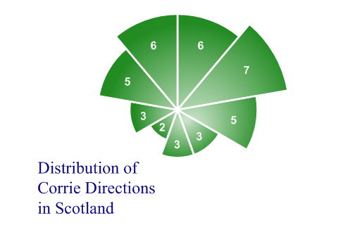
SharpPlot sp = new SharpPlot;

sp.Heading = "Distribution of\nCorrie Directions\nin Scotland";
sp.HeadingStyle = HeadingStyles.Bottom|HeadingStyles.Left;

corries = new int[] {6,7,5,3,3,2,3,5};

sp.PieChartStyle = PieChartStyles.ValueTags|PieChartStyles.RoseDiagram;
sp.SetValueTags(corries);
sp.ValueTagStyle = ValueTagStyles.Inside;
sp.SetValueFont("ARB",12,Color.White);

sp.SetColors(Color.ForestGreen);
sp.SetEdgeStyle(Color.White,LineStyle.Solid,2);

sp.PieRadius = 2400;  // Scale up entire pie

sp.SetFillStyles(FillStyle.Dome);

sp.DrawPieChart(new int[]{1,1,1,1,1,1,1,1,1},corries);
Worked Examples
 |
 |
 |
 |