| Professional charting tools for .Net developers |
Introducing SharpPlot
Your First Chart
Recent Updates
Tutorials
General Tutorials
Chart Tutorials
Reference
SharpPlot Class
Properties
Methods
Structures
Enumerations
Style examples
Glossaries
Active Charts
VectorMath Class
DBUtil Class
Get SharpPlot
Download SharpPlot
Buying SharpPlot
SharpPlot Support
Upgrading from GraPL
Release notes
Home > Sample Charts > PieChart
PieChart
The Piechart is typically used to show how some total value is divided up, for example sales in two or more regions. It works best when there are only a few values, and they should be ranked in numerical order to facilitate comparison of the sector sizes. Pies are often labelled with the actual values in the sectors, and one or more sectors may be ‘exploded’ to emphasise certain values.
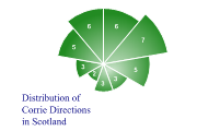
It is also possible to vary the radius of the individual sectors to produce a style of chart often known as the Rose diagram which may be appropriate to some very specific types of data.
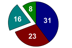
SharpPlot sp = new SharpPlot;
sp.SetMargins(0);
sp.PieChartStyle = PieChartStyles.ValueTags;
sp.ValueTagStyle = ValueTagStyles.Inside;
sp.SetValueFont("Arial",18,FontStyle.Bold,Color.White);
data = new int[] {31,23,16,8};
expl = new int[] {0,0,25,0};
sp.DrawPieChart(data,expl);
Worked Examples
 |
 |
 |
 |