| Professional charting tools for .Net developers |
Introducing SharpPlot
Your First Chart
Recent Updates
Tutorials
General Tutorials
Chart Tutorials
Reference
SharpPlot Class
Properties
Methods
Structures
Enumerations
Style examples
Glossaries
Active Charts
VectorMath Class
DBUtil Class
Get SharpPlot
Download SharpPlot
Buying SharpPlot
SharpPlot Support
Upgrading from GraPL
Release notes
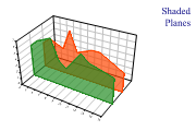
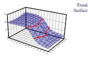
Home > Sample Charts > CloudChart > Shaded planes to compare several series
Shaded planes to compare several series
The Cloud chart is essentially a scatter-plot in 3 dimensions (maybe you are running an experiment in which you vary pressure and temperature, and are interested in the yield of the result). Rather than fitting a line to show the relationship between input and output, you fit a plane (if the data is linear in both x and y) or a curved surface.
This diagram shows the cloud-chart being used in a similar way to the Excel Ribbon chart to compare series. This is generally done for visual effect rather than as a serious attempt to compare the data values. However it does illustrate the versatility of the Cloudchart when used as a general-purpose 3D drawing tool. If you start by setting fixed ranges on all 3 axes, you can draw any number of lines of filled shapes in the rctangular co-ordinate system within the chart walls.
This chart is also drawn with a slightly modified viewpoint. The best viewing angle for any particular dataset is obviously a matter of experiment.
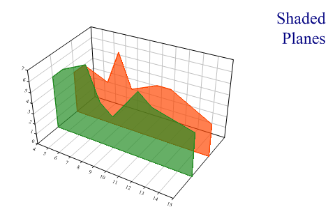
SharpPlot sp = new SharpPlot;
sp.SetMargins(24,24,18,6);

series1 = new int[] {5,6,7,4,3,6,5,4};
series2 = new int[] {4,5,4,7,4,5,5,3};
xdata = new int[] {4,5,7,8,9,11,12,15};

sp.Heading = "Shaded\nPlanes";
sp.HeadingStyle = HeadingStyles.Right;

sp.SetViewpoint(33,18,54);
sp.SetColors(new Color[]{Color.OrangeRed,Color.ForestGreen});
sp.SetFillStyles(FillStyle.Opacity66);
sp.CloudChartStyle = CloudChartStyles.NoMarkers|CloudChartStyles.SurfaceShading|
         CloudChartStyles.Lines|CloudChartStyles.GridLines;
sp.SetYRange(0.5,2.5);
sp.YAxisStyle = YAxisStyles.PlainAxis;
sp.ZAxisStyle = ZAxisStyles.ForceZero;

sp.DrawCloudChart(xdata,new int[]{2,2,2,2,2,2,2,2},series2);  // First plane
sp.DrawCloudChart(xdata,new int[]{1,1,1,1,1,1,1,1},series1);
Worked Examples
 |
 |
 |
 |