| Professional charting tools for .Net developers |
Introducing SharpPlot
Your First Chart
Recent Updates
Tutorials
General Tutorials
Chart Tutorials
Reference
SharpPlot Class
Properties
Methods
Structures
Enumerations
Style examples
Glossaries
Active Charts
VectorMath Class
DBUtil Class
Get SharpPlot
Download SharpPlot
Buying SharpPlot
SharpPlot Support
Upgrading from GraPL
Release notes
Home > Sample Charts > BarChart > Bars, colored by category
Bars, colored by category
This is a very typical political graphic, where a small amount of data must be clearly presented with consistent coloring.
In this example, the political parties are used as categories to achieve the correct colors. The data values are formatted (with embedded linebreaks) to get the labels shown on each bar.
The Y-axis is not required here, so has been turned off.
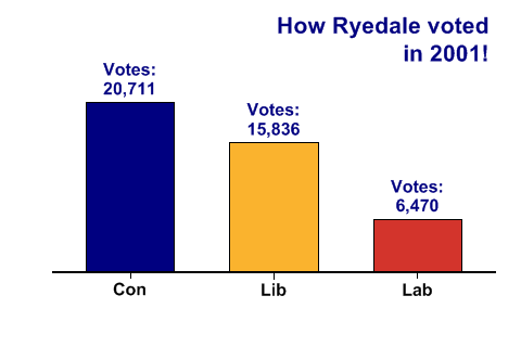
SharpPlot sp = new SharpPlot;

Party = new string[]{"Con","Lib","Lab"};
Vote2001 = new int[] {20711,15836,6470};

sp.SetMargins(42,48,36,18);
sp.Heading = "How Ryedale voted\nin 2001!";
sp.HeadingStyle = HeadingStyles.Right;

sp.SetHeadingFont("ARB",16,Color.Navy);
sp.SetValueFont("ARB",12,Color.Navy);
sp.SetLabelFont("ARB",12,Color.Black);

sp.SetColors(new Color[] {Color.Navy,ColorTranslator.FromHtml("#FAB32E"),
         ColorTranslator.FromHtml("#D3342C")});
sp.SetXLabels(Party);

sp.DataStyle = DataStyles.Rows;  // One series per value is required
sp.BarChartStyle = BarChartStyles.ValueTags;
sp.KeyStyle = KeyStyles.NoKey;

sp.ValueTagFormat = "Votes:\n##,###";
sp.YAxisStyle = YAxisStyles.NoAxis|YAxisStyles.ForceZero;
sp.DrawBarChart(Vote2001);
Worked Examples
 |
 |
 |
 |