| Professional charting tools for .Net developers |
Introducing SharpPlot
Your First Chart
Recent Updates
Tutorials
General Tutorials
Chart Tutorials
Reference
SharpPlot Class
Properties
Methods
Structures
Enumerations
Style examples
Glossaries
Active Charts
VectorMath Class
DBUtil Class
Get SharpPlot
Download SharpPlot
Buying SharpPlot
SharpPlot Support
Upgrading from GraPL
Release notes
Home > Sample Charts > BarChart > Grouped data in a vertical chart
Grouped data in a vertical chart
This simple barchart illustrates several SharpPlot features which are designed to make the programmer’s life easy. Notice how the value-tags hop on top of the bars when they run out of space. In this case the ‘Recolor’ style has been used to have them take on the color of the bar (rather than white) when this happens.
The gap between bars (within each group) has been closed up completely, and the gap between groups reduced to half the width of one bar. By setting both gaps ‘relative to bar’ in this way, SharpPlot will adapt automatically to new data series with more or fewer bars.
Notice how the XLabelFormat has been used to expand slightly on the project identifiers used as labels.
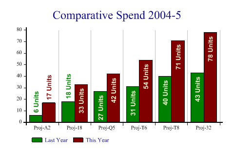
SharpPlot sp = new SharpPlot;

data = new int[][]{new int[]{6,18,27,31,40,43},new int[]{17,33,42,54,71,78}};

sp.Heading = "Comparative Spend 2004-5";
sp.BarChartStyle = BarChartStyles.TicksBetween|BarChartStyles.ValueTags|
         BarChartStyles.ForceZero;
sp.XAxisStyle = XAxisStyles.MiddleLabels|XAxisStyles.GridLines;

sp.ValueTagStyle = ValueTagStyles.Vertical|ValueTagStyles.Inside|
         ValueTagStyles.SectorValues|ValueTagStyles.RecolorOutside;
sp.SetValueFont("Arial",10,FontStyle.Bold,Color.LightYellow);
sp.ValueTagFormat = "###0 Units";

sp.Gap = 0;
sp.GroupGap = 0.5;
sp.SetColors(new Color[]{Color.Green,Color.Maroon});

sp.XLabelFormat = "Proj-XX";
sp.SetXLabels(new string[]{"A2","18","Q5","T6","T8","32"});
sp.SetKeyText(new string[]{"Last Year","This Year"});

sp.DrawBarChart(data);
Worked Examples
 |
 |
 |
 |