| Professional charting tools for .Net developers |
Introducing SharpPlot
Your First Chart
Recent Updates
Tutorials
General Tutorials
Chart Tutorials
Reference
SharpPlot Class
Properties
Methods
Structures
Enumerations
Style examples
Glossaries
Active Charts
VectorMath Class
DBUtil Class
Get SharpPlot
Download SharpPlot
Buying SharpPlot
SharpPlot Support
Upgrading from GraPL
Release notes
Home > Sample Charts > BarChart
BarChart
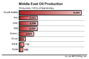
Bar charts are generally used to represent data which fall in clear groupings (such as regional totals) where the bars are equally spaced along an arbitrary X-axis. The bars are often labelled with the data value, or possibly with the name of the group as an alternative to specifying X-axis labels.
SharpPlot treats arrays of arrays of values as representing multiple data series, and creates one group of bars for each series, so two series (each with 12 items) would make 12 pairs of bars, probably labelled ‘Jan’ ...’Dec’. By default, the bars are drawn as groups (you may control the spacing with the Gap and GroupGap properties) but the bars may also be stacked to show a cumulative total. The Key would generally be used to identify the groups – if you have used GroupBy to create the groups from a single column of data, the key is preset for you to the group names.
Barcharts are normally drawn vertically, but may be switched to horizontal if required. This is often a better style of the bar labels may be quite long, as it is easy to make more space in the left margin.
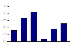
SharpPlot sp = new SharpPlot;
sp.SetMargins(12,12,18,4);
data = new int[] {18,27,31,12,19,23};
sp.DrawBarChart(data);
Worked Examples
 |
 |
 |
 |