| Professional charting tools for .Net developers |
Introducing SharpPlot
Your First Chart
Recent Updates
Tutorials
General Tutorials
Chart Tutorials
Reference
SharpPlot Class
Properties
Methods
Structures
Enumerations
Style examples
Glossaries
Active Charts
VectorMath Class
DBUtil Class
Get SharpPlot
Download SharpPlot
Buying SharpPlot
SharpPlot Support
Upgrading from GraPL
Release notes
Home > Sample Charts > PolarChart > Summarizing Directional Data
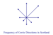
Summarizing Directional Data
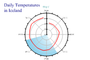
The Polar chart may be used in several ways to handle cyclic timeseries or comparisons on many dimensions. If it is called with a simple list of numbers, it treats each value as a logical axis and simply plots the values out as a star shape with as many points as there were values.
This format is often called a Radar chart, although it could have been plotted with additional angular values, if the directions were not equally spaced around the circle. It shows an alternative presentation to the Rose diagram of the corrie data from the Scottish highlands.
Scaled markers could be used instead of arrows with this chart style to give an indication of average size as well as frequency of occurence. This is probably a more ‘honest’ chart than the equivalent Rose diagram, as it does not exaggerate the larger numbers in the same way.
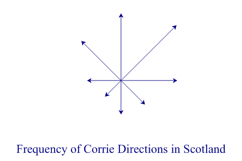
SharpPlot sp = new SharpPlot;

sp.Heading = "Frequency of Corrie Directions in Scotland";

corries = new int[] {6,7,5,3,3,2,3,5};

sp.PolarChartStyle = PolarChartStyles.Risers|PolarChartStyles.ArrowLines|
         PolarChartStyles.NoLines;
sp.HeadingStyle = HeadingStyles.Bottom;
sp.SetPenWidths(0.8);
sp.SetMargins(0);
sp.YAxisStyle = YAxisStyles.NoAxis|YAxisStyles.ForceZero;
sp.XAxisStyle = XAxisStyles.NoAxis;
sp.SetArrowStyle(6,30);  // Size,angle

sp.DrawPolarChart(corries);
Worked Examples
 |
 |
 |
 |