| Professional charting tools for .Net developers |
Introducing SharpPlot
Your First Chart
Recent Updates
Tutorials
General Tutorials
Chart Tutorials
Reference
SharpPlot Class
Properties
Methods
Structures
Enumerations
Style examples
Glossaries
Active Charts
VectorMath Class
DBUtil Class
Get SharpPlot
Download SharpPlot
Buying SharpPlot
SharpPlot Support
Upgrading from GraPL
Release notes
Home > Sample Charts > PolarChart > Comparing Features with a Radar Chart
Comparing Features with a Radar Chart
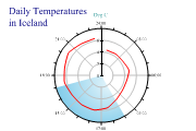
The Polar chart (also known as the Radar chart) may be used in several ways to handle cyclic timeseries or comparisons on many dimensions. If it is called with a simple list of numbers, it treats each value as a logical axis and simply plots the values out as a star shape with as many points as there were values.
This chart compares two fictional vehicles based on seven criteria which are plotted as radial lines.
The semi-transparent overlay makes it very easy to compare the ‘shapes’ which characterise the two sets of data.
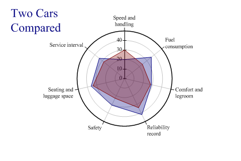
SharpPlot sp = new SharpPlot;

sp.Heading = "Two Cars\nCompared";
sp.HeadingStyle = HeadingStyles.Left;

Volvo = new int[] {20,36,29,42,31,36,34};
Saab = new int[] {30,24,28,34,23,34,28};
criteria = new string[]{"Speed and handling","Fuel consumption",
         "Comfort and legroom","Reliability record","Safety",
         "Seating and luggage space","Service interval"};

sp.PolarChartStyle = PolarChartStyles.GridLines|PolarChartStyles.SurfaceShading;
sp.YAxisStyle = YAxisStyles.ForceZero;
sp.MarginLeft = 12;
sp.MarginRight = 0;
sp.SetXLabels(criteria);
sp.XLabelFormat = "XXXXXXXXX;";
sp.LabelLineSpacing = 120;

sp.SetFillStyles(FillStyle.Opacity30);

polardata = new int[][]{Volvo,Saab};
sp.DrawPolarChart(polardata,new int[0]);
Worked Examples
 |
 |
 |
 |