| Professional charting tools for .Net developers |
Introducing SharpPlot
Your First Chart
Recent Updates
Tutorials
General Tutorials
Chart Tutorials
Reference
SharpPlot Class
Properties
Methods
Structures
Enumerations
Style examples
Glossaries
Active Charts
VectorMath Class
DBUtil Class
Get SharpPlot
Download SharpPlot
Buying SharpPlot
SharpPlot Support
Upgrading from GraPL
Release notes
Home > Sample Charts > BubbleChart > Weighted modelfit
Weighted modelfit
This chart is a variant of the standard ScatterPlot with the size of the markers used to show an extra dimension in the data. The third argument gives the required marker area (typically the number of incidents recorded at a certain location) and all the markers are automatically scaled to cover the range of areas given.
This example illustrates the way the regression line is weighted by the count at each data-point.
You can see that the fitted line is strongly biased towards the points with more data.
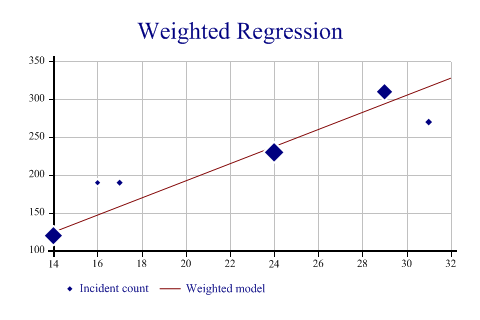
SharpPlot sp = new SharpPlot;

sp.Heading = "Weighted Regression";
ydata = new int[] {190,270,310,120,190,230};
xdata = new int[] {17,31,29,14,16,24};
count = new int[] {12,15,77,97,9,112};

sp.SetYTickMarks(50);

sp.SetMarkers(Marker.Lozenge);
sp.BubbleChartStyle = BubbleChartStyles.GridLines|BubbleChartStyles.ModelFit|
         BubbleChartStyles.HaloMarkers;

sp.DrawBubbleChart(ydata,xdata,count);
sp.SetKeyText(new string[]{"Incident count","Weighted model"});
Worked Examples
 |
 |
 |
 |