| Professional charting tools for .Net developers |
Introducing SharpPlot
Your First Chart
Recent Updates
Tutorials
General Tutorials
Chart Tutorials
Reference
SharpPlot Class
Properties
Methods
Structures
Enumerations
Style examples
Glossaries
Active Charts
VectorMath Class
DBUtil Class
Get SharpPlot
Download SharpPlot
Buying SharpPlot
SharpPlot Support
Upgrading from GraPL
Release notes
Home > Sample Charts > BubbleChart > Two categories, to compare series
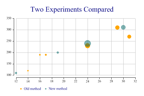
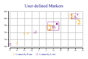
Two categories, to compare series
This chart is a variant of the standard ScatterPlot with the size of the markers used to show an extra dimension in the data. The third argument gives the required marker area (typically the number of incidents recorded at a certain location) and all the markers are automatically scaled to cover the range of areas given.
This chart shows data collected from two similar experiments, and allows a quick comparison of the success of each (maybe the number of seeds which germinated under given lighting and temperature).
Note that the axes are ‘exploded’ here to keep them out of the way of the data. Note also the use of semi-transparent markers to avoid the second series obscuring results from the first.
SharpPlot sp = new SharpPlot;
ydata = new int[] {190,270,310,120,190,230,200,240,311,110};
xdata = new int[] {17,31,29,14,16,24,19,24,30,12};
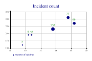
count = new int[] {12,65,77,7,9,112,18,194,90,17};
type = new int[] {1,1,1,1,1,1,2,2,2,2};
sp.Heading = "Two Experiments Compared";
sp.SetMarkers(Marker.Bullet);
sp.SetColors(new Color[] {Color.Orange,ColorTranslator.FromHtml("#80006666")});
sp.BubbleChartStyle = BubbleChartStyles.GridLines|BubbleChartStyles.ExplodeAxes;
sp.SetKeyText(new string[]{"Old method","New method"});
sp.SplitBy(type);
sp.DrawBubbleChart(ydata,xdata,count);
Worked Examples
 |
 |
 |
 |