| Professional charting tools for .Net developers |
Introducing SharpPlot
Your First Chart
Recent Updates
Tutorials
General Tutorials
Chart Tutorials
Reference
SharpPlot Class
Properties
Methods
Structures
Enumerations
Style examples
Glossaries
Active Charts
VectorMath Class
DBUtil Class
Get SharpPlot
Download SharpPlot
Buying SharpPlot
SharpPlot Support
Upgrading from GraPL
Release notes
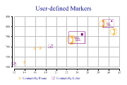
Home > Sample Charts > BubbleChart > User-defined Markers showing categories
User-defined Markers showing categories
This chart is a variant of the standard ScatterPlot with the size of the markers used to show an extra dimension in the data. The third argument gives the required marker area (typically the number of incidents recorded at a certain location) and all the markers are automatically scaled to cover the range of areas given.
This example exploits two standard WingDings characters to show the number of contacts by phone and mail.
Note that there is no need to have the markers drawn semi-transparently here as all character markers are drawn in outline. Several other characters in the WingDings font are extremely useful for categorised data, for example the circled numbers may be used to represent up to 20 categories very effectively.
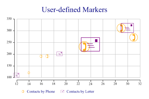
SharpPlot sp = new SharpPlot;

sp.Heading = "User-defined Markers";

ydata = new int[] {190,270,310,120,190,230,200,240,311,110};
xdata = new int[] {17,31,29,14,16,23,19,24,30,12};
count = new int[] {12,65,77,7,9,112,18,194,90,17};
type = new int[] {1,1,1,1,1,1,2,2,2,2};

sp.SetColors(new Color[]{Color.Orange,Color.Purple});

// Telephone and Letter symbols
sp.SetMarkers(new Marker[]{(new Marker("wingdings,9,)")),new Marker("wingdings,9,+")});
sp.BubbleChartStyle = BubbleChartStyles.GridLines|BubbleChartStyles.ExplodeAxes;

sp.SplitBy(type);
sp.DrawBubbleChart(ydata,xdata,count);
sp.SetKeyText(new string[]{"Contacts by Phone","Contacts by Letter"});
Worked Examples
 |
 |
 |
 |