| Professional charting tools for .Net developers |
Introducing SharpPlot
Your First Chart
Recent Updates
Tutorials
General Tutorials
Chart Tutorials
Reference
SharpPlot Class
Properties
Methods
Structures
Enumerations
Style examples
Glossaries
Active Charts
VectorMath Class
DBUtil Class
Get SharpPlot
Download SharpPlot
Buying SharpPlot
SharpPlot Support
Upgrading from GraPL
Release notes
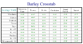
Home > Sample Charts > Table > Creating a CrossTab from the Barley Data
Creating a CrossTab from the Barley Data
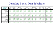
Tables are often used very effectively in combination with other charts to add summarized information. For example a plot of a stock price might include a small table of the low and high values for the past year, and maybe a comparison with the industry sector.
The barley-yield data from the Boxplot tutorial is a good candidate for a Cross-tab. The two methods that do this are GroupBy (to collect data into the rows) and SplitBy to spread the values across the columns.
Here it has been summarised by Variety and categorised by Year as a 2-way table. You can summarize or split by up to 2 levels here to create more complex tabulations.
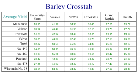
SharpPlot sp = new SharpPlot;

sp.Heading = "Barley Crosstab";

sp.SplitBy(_barleyfarm);
sp.GroupBy(_barleyvariety,GroupByFunction.Average);

sp.TableStyle = TableStyles.GridLines;
sp.XLabelFormat = "xxxxxxxxx;";

sp.YCaption = "Average Yield";

sp.ValueTagFormat = "##0.00";
sp.ValueTagStyle = ValueTagStyles.Center;

sp.DrawTable(_barleydata);
Worked Examples
 |
 |
 |
 |