| Professional charting tools for .Net developers |
Introducing SharpPlot
Your First Chart
Recent Updates
Tutorials
General Tutorials
Chart Tutorials
Reference
SharpPlot Class
Properties
Methods
Structures
Enumerations
Style examples
Glossaries
Active Charts
VectorMath Class
DBUtil Class
Get SharpPlot
Download SharpPlot
Buying SharpPlot
SharpPlot Support
Upgrading from GraPL
Release notes
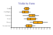
Home > Sample Charts > BoxPlot > Horizontal boxplot of barley data by farm
Horizontal boxplot of barley data by farm
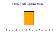
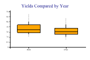
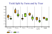
A selection of simple Box-and-Whisker charts are developed here, all using a ‘classic’ dataset from the 1930s showing barley yields at various farms in Canada. The trials were made at 6 farms over 2 years, with 10 varieties of barley, giving 120 data-points in total. The entire dataset is shown for reference in the glossary.
The object of the trial was to see what the significant effects were, and the boxplot is an ideal way to explore relationships between variables. The example shows the effect of splitting the data by farm name, using a horizontal plot to leave plenty of room for the longer names.
That looks clear enough! The best yield at Duluth is barely up to the poorest result at Waseca. Some farms are also much more variable, so maybe we should look at combinations of variables as well as a single factor.

SharpPlot sp = new SharpPlot;
sp.SetBackground(Color.White,FillStyle.Solid);

sp.MarginLeft = 72;
sp.Heading = "Yields by Farm";
sp.SetColors(Color.Orange);
sp.XAxisStyle = XAxisStyles.ForceZero;
sp.BoxPlotStyle = BoxPlotStyles.Horizontal;
sp.DrawBoxPlot(yield,farm);
Worked Examples
 |
 |
 |
 |