| Professional charting tools for .Net developers |
Introducing SharpPlot
Your First Chart
Recent Updates
Tutorials
General Tutorials
Chart Tutorials
Reference
SharpPlot Class
Properties
Methods
Structures
Enumerations
Style examples
Glossaries
Active Charts
VectorMath Class
DBUtil Class
Get SharpPlot
Download SharpPlot
Buying SharpPlot
SharpPlot Support
Upgrading from GraPL
Release notes
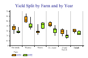
Home > Sample Charts > BoxPlot > Boxplot of barley data categorised by year
Boxplot of barley data categorised by year
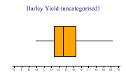
A selection of simple Box-and-Whisker charts are developed here, all using a ‘classic’ dataset from the 1930s showing barley yields at various farms in Canada. The trials were made at 6 farms over 2 years, with 10 varieties of barley, giving 120 data-points in total. The entire dataset is shown for reference in the glossary.
The object of the trial was to see what the significant effects were, and the boxplot is an ideal way to explore relationships between variables. You might also check on the histograms of various subsets of the data, maybe using a Multiple chart to split the data by various criteria.
The chart shows the Median yield is about 32kg per acre, with 75% of the values falling in the range 26-42. There are outliers on both sides, and the shape of the data looks a little skewed. SharpPlot has been told not to draw a Y-Axis here, as the vertical dimension is meaningless.
This is drawn with ‘Deciles’ shown in the whiskers, which indicate that the lower end of the range has a few outlying values. However it is fairly clear that there was not a big difference between the years.
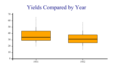
SharpPlot sp = new SharpPlot;

sp.Heading = "Yields Compared by Year";
sp.SetColors(Color.Orange);
sp.YAxisStyle = YAxisStyles.ForceZero;
sp.BoxPlotStyle = BoxPlotStyles.DecileWhiskers;
sp.DrawBoxPlot(yield,years);
Worked Examples
 |
 |
 |
 |