| Professional charting tools for .Net developers |
Introducing SharpPlot
Your First Chart
Recent Updates
Tutorials
General Tutorials
Chart Tutorials
Reference
SharpPlot Class
Properties
Methods
Structures
Enumerations
Style examples
Glossaries
Active Charts
VectorMath Class
DBUtil Class
Get SharpPlot
Download SharpPlot
Buying SharpPlot
SharpPlot Support
Upgrading from GraPL
Release notes
Home > Sample Charts > BoxPlot
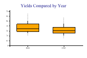
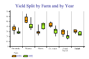
BoxPlot
Tukey’s Box-and-Whisker design is often the best way to approach a large dataset when it is not clear what the significant relationships are. The ‘box’ shows the span of the data between the lower and upper quartiles, with a bar drawn at the median value. The ‘Whiskers’ show the total span of the data – you can use the ‘Deciles’ style to have a dotted line drawn from the 10% and 90% points out to the extremes to reduce the visual impact of outliers.
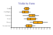
Boxplots may be drawn vertically (the default) or horizontally (useful when the labels are quite long).
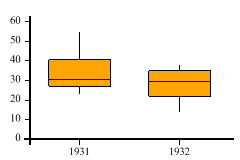
SharpPlot sp = new SharpPlot;
sp.SetMargins(12,12,18,4);
years = new int[] {1931,1931,1931,1931,1931,1931,1931,1931,1931,1931,1931,1931,1931,
         1931,1931,1931,1931,1931,1931,1931,1931,1931,1931,1931,1932,1932,1932,1932,
         1932,1932,1932,1932,1932,1932,1932,1932,1932,1932,1932,1932,1932,1932,1932,
         1932,1932,1932,1932,1932};
yield = new int[] {27,48,27,39,32,28,43,55,28,38,29,29,35,47,25,40,29,25,39,50,26,
         41,23,26,26,33,34,32,22,22,36,37,35,26,14,25,27,38,35,20,16,22,26,37,38,32,
         32,22};
sp.SetColors(Color.Orange);
sp.YAxisStyle = YAxisStyles.ForceZero;
sp.DrawBoxPlot(yield,years);
Worked Examples
 |
 |
 |
 |