| Professional charting tools for .Net developers |
Introducing SharpPlot
Your First Chart
Recent Updates
Sample Charts
General Tutorials
Reference
SharpPlot Class
Properties
Methods
Structures
Enumerations
Style examples
Glossaries
Active Charts
VectorMath Class
DBUtil Class
Get SharpPlot
Download SharpPlot
Buying SharpPlot
SharpPlot Support
Upgrading from GraPL
Release notes
Tutorials > Chart Tutorials > Using Scatter Plots with XY Data
Using Scatter Plots with XY Data
The scatterplot (or scatter diagram) is almost always the first step in analysing any collection of data. Typically you are trying ti isolate one or more causes, in the attempt to predict some effect. These examples all use some data on house-prices, with the idea of being able to predict the price of any house given its type and floor area.
A Simple Scatter of 2 Variables
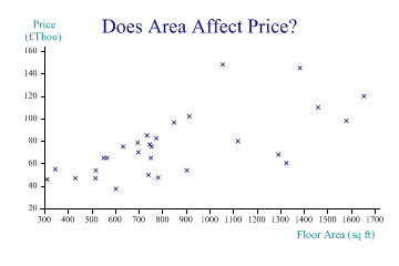
The first step is simply to plot the price against most likely cause (floor area) as a simple xy plot:

area = new int[] {1326,782,312,1460,1056,752,1120,904,1654,735,565,346,698,775,696,
         741,432,517,747,914,603,1292,551,1383,1580,754,850,518,634};
price = new int[] {60500,47500,46000,110000,148000,65000,79950,54000,120000,85000,
         65000,55000,70000,82500,78500,49950,46950,46950,77000,102000,37500,68000,
         65000,145000,98000,75000,96500,53950,75000};

sp.Heading = "Does Area Affect Price?";
sp.YAxisStyle = YAxisStyles.AtEndCaption;
sp.YCaption = "Price\n(£Thou)";
sp.YFactor = 1000;
sp.XCaption = "Floor Area (sq ft)";

sp.DrawScatterPlot(price,area);
So there is a relationship here, but there is also a lot of apparently random noise.
Using a Quadratic Model
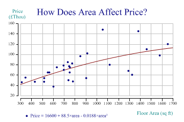
The second example shows a ‘best fit’ model, assuming that there may be a quadratic relationship between floor area and price:

sp.Heading = "How Does Area Affect Price?";
sp.YAxisStyle = YAxisStyles.AtEndCaption;
sp.YCaption = "Price\n(£Thou)";
sp.YFactor = 1000;
sp.XCaption = "Floor Area (sq ft)";

sp.SetMarkers(Marker.Bullet);

sp.ScatterPlotStyle = ScatterPlotStyles.ModelFit|ScatterPlotStyles.GridLines|
         ScatterPlotStyles.ExplodeAxes;
sp.SetOrderOfFit(2);
sp.EquationFormat = "Price = C0 + C1×area + C2×area²";

sp.DrawScatterPlot(price,area);

sp.SetKeyText(sp.Equation);
The equation has been formatted, and used as the text for the key. Note that you cannot retrieve the equation of coefficients until after the plot has been run – this is one of the few places in SharpPlot where the order of the commands is crucial!
Using Logarithmic Axes
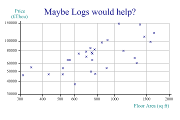
This example shows one obvious way of transforming the data, by making both X and Y axes logarithmic.

sp.Heading = "Maybe Logs would help?";
sp.YCaption = "Price\n(£Thou)";
sp.XCaption = "Floor Area (sq ft)";

sp.YAxisStyle = YAxisStyles.LogScale|YAxisStyles.AtEndCaption;
sp.XAxisStyle = XAxisStyles.LogScale;

sp.ScatterPlotStyle = ScatterPlotStyles.GridLines;

sp.DrawScatterPlot(price,area);
Transforming, scaling or shifting the data is often an essential part of helping to see patterns. However it made very little difference in this particular example!
Adding Another Dimension
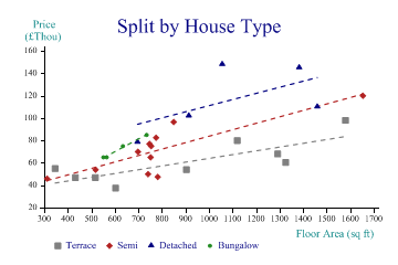
Maybe the type of house is an important factor here?

Suddenly, this makes the prediction a lot more reliable. We can see that for terrace houses (the grey squares) the relationship between area and price is quite linear and has very little scatter. Semi-detached houses all cluster at the left-hand end, apart from one huge one which we may want to disregard, as being very atypical. Detached houses follow a different model entirely, and bungalows are apparently more sensitive to area, but we have very little data for them.
sp.Heading = "Split by House Type";
sp.YAxisStyle = YAxisStyles.AtEndCaption;
sp.YCaption = "Price\n(£Thou)";
sp.YFactor = 1000;
sp.XCaption = "Floor Area (sq ft)";

housetype = new int[] {1,2,2,3,3,2,1,1,2,4,4,1,2,2,3,2,1,1,2,3,1,1,4,3,1,2,2,2,4};
sp.SplitBy(housetype);

sp.ScatterPlotStyle = ScatterPlotStyles.ModelFit;
sp.EquationStyle = EquationStyles.SpanData;
sp.SetMarkers(new Marker[]{Marker.Block,Marker.Lozenge,Marker.Triangle,Marker.Bullet});
sp.SetColors(new Color[]{Color.Gray,Color.Gray,Color.Firebrick,Color.Firebrick,
         Color.Navy,Color.Navy,Color.ForestGreen,Color.ForestGreen});
sp.SetLineStyles(LineStyle.Dash);
sp.SetPenWidths(1.2);

sp.DrawScatterPlot(price,area);

sp.SetKeyText(new string[]{"Terrace","","Semi","","Detached","","Bungalow"});
Note the ‘placeholder’ entries in the key text here. SharpPlot adds a key placeholder for each series and for each modelfit (or trendline) added to it. This allows you to add specific legends to describe the model as well as to annotate each marker. However in this case the model is ‘obvious’ and we just have empty strings for the alternate entries in the legend.
This is also the reason why the color cycle is preset with pair of matching colors – the marker takes the first of the pair and the line takes the second.
Summary
By plotting the raw data, and trying a few splits on different dimensions, you can usually begin to understand the relationships involved. SharpPlot provides some simple tools for adding fitted models and showing the user the resulting equation.
See also ...
More about Bubble Charts | Understanding Contour Plots