| Professional charting tools for .Net developers |
Introducing SharpPlot
Your First Chart
Recent Updates
Sample Charts
General Tutorials
Reference
SharpPlot Class
Properties
Methods
Structures
Enumerations
Style examples
Glossaries
Active Charts
VectorMath Class
DBUtil Class
Get SharpPlot
Download SharpPlot
Buying SharpPlot
SharpPlot Support
Upgrading from GraPL
Release notes
Tutorials > Chart Tutorials > More about Bubble Charts
More about Bubble Charts
This tutorial builds four simple examples of bubble-charts, showing how the markers scale to represent an extra dimension in the data. Regression models may be used with the bubble-chart – naturally the area of the bubble weights the model-fit appropriately. User-defined markers can be used to good effect also, as the final example illustrates.
A Simple Weighted Scatter
This is the most obvious use of the bubblechart. Three vectors of data are provided, giving the x,y co-ordinates of each value and a count of the number of items at that point.
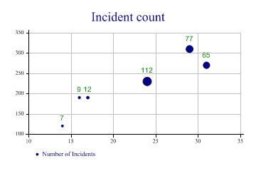
sp.Heading = "Incident count";

sp.SetXTickMarks(5);
sp.SetYTickMarks(50);

sp.SetMarkers(Marker.Bullet);
sp.BubbleChartStyle = BubbleChartStyles.GridLines|BubbleChartStyles.ValueTags;
sp.SetValueTags(count);
sp.SetValueFont("Arial",10);
sp.DrawBubbleChart(ydata,xdata,count);
sp.SetKeyText("Number of Incidents");
Note that this chart adds Value tags to the markers to give an exact value for the count at that point.
Two categories, to compare series
This chart shows data collected from two similar experiments, and allows a quick comparison of the success of each (maybe the number of seeds which germinated under gven lighting and temperature).
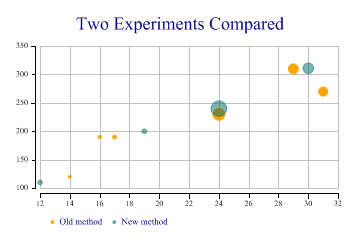
ydata = new int[] {190,270,310,120,190,230,200,240,311,110};
xdata = new int[] {17,31,29,14,16,24,19,24,30,12};
count = new int[] {12,65,77,7,9,112,18,194,90,17};
type = new int[] {1,1,1,1,1,1,2,2,2,2};

sp.Heading = "Two Experiments Compared";

sp.SetMarkers(Marker.Bullet);
sp.SetColors(new Color[] {Color.Orange,ColorTranslator.FromHtml("#80006666")});

sp.BubbleChartStyle = BubbleChartStyles.GridLines|BubbleChartStyles.ExplodeAxes;
sp.SetKeyText(new string[]{"Old method","New method"});
sp.SplitBy(type);
sp.DrawBubbleChart(ydata,xdata,count);
Note that the axes are ‘exploded’ here to keep them out of the way of the data. Note also the use of semi-transparent markers to avoid the second series obscuring results from the first.
Weighted modelfit
This example illustrates the way the regression line is weighted by the count at each data-point.
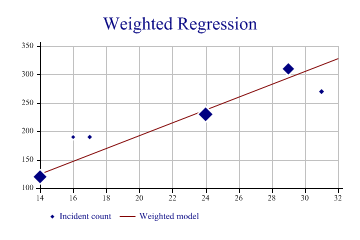
sp.Heading = "Weighted Regression";
ydata = new int[] {190,270,310,120,190,230};
xdata = new int[] {17,31,29,14,16,24};
count = new int[] {12,15,77,97,9,112};

sp.SetYTickMarks(50);

sp.SetMarkers(Marker.Lozenge);
sp.BubbleChartStyle = BubbleChartStyles.GridLines|BubbleChartStyles.ModelFit|
         BubbleChartStyles.HaloMarkers;

sp.DrawBubbleChart(ydata,xdata,count);
sp.SetKeyText(new string[]{"Incident count","Weighted model"});
You can see that the fitted line is strongly biased towards the points with more data.
User-defined Markers showing categories
This example exploits two standard WingDings characters to show the number of contacts by phone and mail.
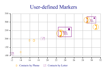
sp.Heading = "User-defined Markers";

ydata = new int[] {190,270,310,120,190,230,200,240,311,110};
xdata = new int[] {17,31,29,14,16,23,19,24,30,12};
count = new int[] {12,65,77,7,9,112,18,194,90,17};
type = new int[] {1,1,1,1,1,1,2,2,2,2};

sp.SetColors(new Color[]{Color.Orange,Color.Purple});

// Telephone and Letter symbols
sp.SetMarkers(new Marker[]{(new Marker("wingdings,9,)")),new Marker("wingdings,9,+")});
sp.BubbleChartStyle = BubbleChartStyles.GridLines|BubbleChartStyles.ExplodeAxes;

sp.SplitBy(type);
sp.DrawBubbleChart(ydata,xdata,count);
sp.SetKeyText(new string[]{"Contacts by Phone","Contacts by Letter"});
Note that there is no need to have the markers drawn semi-transparently here as they are only drawn in outline. Several other characters in the WingDings font are extremely useful for categorised data, for example the circled numbers may be used to represent up to 20 categories very effectively.
Summary
The Bubblechart is an effective way of combining dimensions where you need to show how many events occurred at a particular combination of X and Y values (such as the number of artifacts found in each grid square on a field survey). Transparency can be used effectively where there are many overlapping bubbles.