| Professional charting tools for .Net developers |
Introducing SharpPlot
Your First Chart
Recent Updates
Tutorials
General Tutorials
Chart Tutorials
Reference
SharpPlot Class
Properties
Methods
Structures
Enumerations
Style examples
Glossaries
Active Charts
VectorMath Class
DBUtil Class
Get SharpPlot
Download SharpPlot
Buying SharpPlot
SharpPlot Support
Upgrading from GraPL
Release notes
Home > Sample Charts > TraceChart > Adding Categories
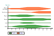
Adding Categories
Trace charts are a slightly specialist style of plot, originally designed for data from devices like seismographs and EEGs where multiple pens trace out (almost) parallel lines. Each pen is allocated a tickmark on the Y-axis and then an ‘inner axis’ is created for it (naturally these inner axes are all scaled identically).
All styles of Tracechart can categorise data by cycling through colors of fill-styles. The example chooses to segregate two types of tree species, but otherwise is identical to the third chart in this set.
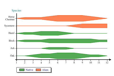
SharpPlot sp = new SharpPlot;

sycamore = new int[] {0,0,0,0,0,0,0,1,2,2,2,2};
chestnut = new int[] {0,1,1,1,2,3,3,3,3,2,1,0};

sp.YCaption = "Species";
sp.YAxisStyle = YAxisStyles.AtEndCaption|YAxisStyles.GridLines;
sp.SetYLabels(new string[]{"Oak","Ash","Birch","Hazel","Sycamore","Horse Chestnut"});

sp.XAxisStyle = XAxisStyles.ArrowedAxis;
sp.YLabelFormat = "XXXXXXXX;";
sp.MarginLeft = 48;

sp.TraceChartStyle = TraceChartStyles.KiteDiagram;
sp.IAxisStyle = IAxisStyles.PlainAxis;
sp.SetFillStyles(FillStyle.Saturate80);

sp.KeyStyle = KeyStyles.Boxed|KeyStyles.Shadowed;
native = new string[]{"Native","Native","Native","Native","Alien","Alien"};
sp.SplitBy(native);

sp.SetColors(new Color[]{Color.Green,Color.OrangeRed});

trace = new int[][]{oak,ash,birch,hazel,sycamore,chestnut};
sp.DrawTraceChart(trace);
Worked Examples
 |
 |
 |
 |