| Professional charting tools for .Net developers |
Introducing SharpPlot
Your First Chart
Recent Updates
Tutorials
General Tutorials
Chart Tutorials
Reference
SharpPlot Class
Properties
Methods
Structures
Enumerations
Style examples
Glossaries
Active Charts
VectorMath Class
DBUtil Class
Get SharpPlot
Download SharpPlot
Buying SharpPlot
SharpPlot Support
Upgrading from GraPL
Release notes
Home > Sample Charts > TowerChart > Two-way Summary shown as Towers
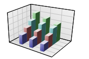
Two-way Summary shown as Towers
Towercharts are simply grouped barcharts with the bars drawn ‘behind’ each other rather than in groups along the X-axis. They are best used where the visual effect is more important than the readability of the data values, as it is almost impossible to read the ‘height’ values reliably, and it is very likely that in a crowded chart some towers will be completely obscured.
You can think of a Towerchart as a grouped barchart, with the splitting working away from the X-axis, rather than into collections of narrow bars. Towers are normally drawn with relatively few parallel sets of columns, so it is generally best to have the category with most entries as the ‘groups’ and the one with fewer entries as the ‘split’.
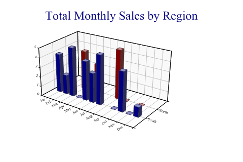
SharpPlot sp = new SharpPlot;

region = new string[]{"North","North","North","North","South","South","South",
         "South","South","South","South","South"};
regions = new string[]{"South","North"};

month = new string[]{"Jan","Mar","May","Aug","Jan","Feb","Mar","May","Jun","Jul","Oct","Dec"};
sales = new int[] {3,4,3,5,4,2,5,4,3,5,4,1};
months = new string[]{"Jan","Feb","Mar","Apr","May","Jun","Jul","Aug","Sep","Oct",
         "Nov","Dec"};

sp.Heading = "Total Monthly Sales by Region";
sp.GroupBy(month,months);  // Sum is default
sp.SplitBy(region,regions);

sp.XAxisStyle = XAxisStyles.AngledLabels;
sp.YAxisStyle = YAxisStyles.AngledLabels;

sp.TowerChartStyle = TowerChartStyles.WallShading|TowerChartStyles.GridLines;
sp.DrawTowerChart(sales);
Worked Examples
 |
 |
 |
 |