| Professional charting tools for .Net developers |
Introducing SharpPlot
Your First Chart
Recent Updates
Tutorials
General Tutorials
Chart Tutorials
Reference
SharpPlot Class
Properties
Methods
Structures
Enumerations
Style examples
Glossaries
Active Charts
VectorMath Class
DBUtil Class
Get SharpPlot
Download SharpPlot
Buying SharpPlot
SharpPlot Support
Upgrading from GraPL
Release notes
Home > Sample Charts > ScatterPlot > Using Logarithmic Axes
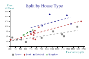
Using Logarithmic Axes
The Scatter plot is most often used to answer questions like “How does Age affect Reaction time?” where you have a variety of measurements and are trying to get an impression of the relationships between them. Of course a relationship does not always imply causality, but with care it is usually possible to make a predictive model which gives useful information.
This example shows one obvious way of transforming the data, by making both X and Y axes logarithmic. Transforming, scaling or shifting the data is often an essential part of helping to see patterns. However it made very little difference in this particular example!
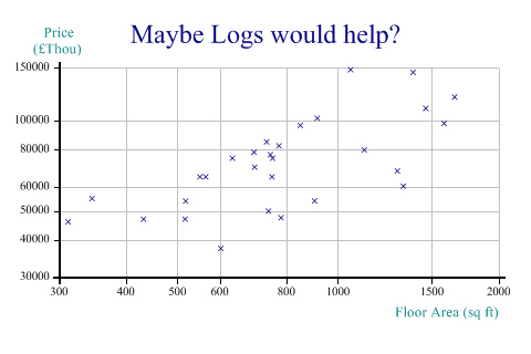
SharpPlot sp = new SharpPlot;

sp.Heading = "Maybe Logs would help?";
sp.YCaption = "Price\n(£Thou)";
sp.XCaption = "Floor Area (sq ft)";

sp.YAxisStyle = YAxisStyles.LogScale|YAxisStyles.AtEndCaption;
sp.XAxisStyle = XAxisStyles.LogScale;

sp.ScatterPlotStyle = ScatterPlotStyles.GridLines;

sp.DrawScatterPlot(price,area);
Worked Examples
 |
 |
 |
 |