| Professional charting tools for .Net developers |
Introducing SharpPlot
Your First Chart
Recent Updates
Tutorials
General Tutorials
Chart Tutorials
Reference
SharpPlot Class
Properties
Methods
Structures
Enumerations
Style examples
Glossaries
Active Charts
VectorMath Class
DBUtil Class
Get SharpPlot
Download SharpPlot
Buying SharpPlot
SharpPlot Support
Upgrading from GraPL
Release notes
Home > Sample Charts > Multiples > Constructing a dashboard
Constructing a dashboard
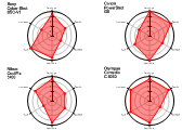
One of the best innovations in Tufte’s “The Visual Display of Quantitative Information” is the idea of using an array of miniature charts to display multi-dimensional data. Often a series of values are recorded at (say) several sites or on several days, then are superimposed on a single chart as a collection of dotted and dashed lines in various colors. This often makes it very hard to see the patterns and relationships in the data.
This example automates a typical use of the dial chart, which are often grouped in arrays to show related values.
Note that the range and warning zone will be common to all the charts in the trellis.
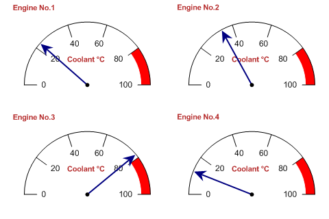
SharpPlot sp = new SharpPlot;

sp.SetXRange(100);
sp.SetXZones(new Zone(80,100,Color.Red,FillStyle.Solid));
sp.SetPenWidths(1.5);
sp.DialChartStyle = DialChartStyles.ArrowLines;

sp.SetPageLabels(new string[]{"Engine No.1","Engine No.2","Engine No.3","Engine No.4"});
sp.XCaption = "Coolant °C";

sp.SetLabelFont("Arial",13);
sp.SetCaptionFont("Arial",15,FontStyle.Bold,Color.Firebrick);

sp.DrawMultiple(ChartType.DialChart,new int[]{23,34,78,12});
Worked Examples
 |
 |
 |
 |