| Professional charting tools for .Net developers |
Introducing SharpPlot
Your First Chart
Recent Updates
Tutorials
General Tutorials
Chart Tutorials
Reference
SharpPlot Class
Properties
Methods
Structures
Enumerations
Style examples
Glossaries
Active Charts
VectorMath Class
DBUtil Class
Get SharpPlot
Download SharpPlot
Buying SharpPlot
SharpPlot Support
Upgrading from GraPL
Release notes
Home > Sample Charts > Multiples > Comparing two datasets
Comparing two datasets
One of the best innovations in Tufte’s “The Visual Display of Quantitative Information” is the idea of using an array of miniature charts to display multi-dimensional data. Often a series of values are recorded at (say) several sites or on several days, then are superimposed on a single chart as a collection of dotted and dashed lines in various colors. This often makes it very hard to see the patterns and relationships in the data.
This example is the simplest form of multiple chart. Two sets of data are compared by being plotted side-by-side as barcharts. Note that the multiple chart has very few styles of its own – here the example uses the YAxisStyle to have both charts constrained to show the zero point.
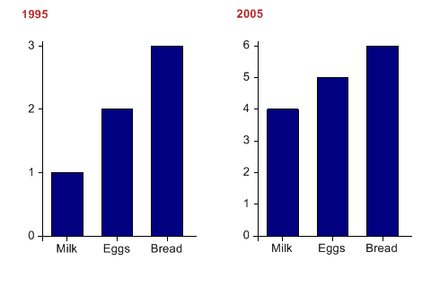
SharpPlot sp = new SharpPlot;

sp.SetPageLabels(new string[]{"1995","2005"});
sp.SetXLabels(new string[]{"Milk","Eggs","Bread"});

sp.YAxisStyle = YAxisStyles.ForceZero;
sp.SetLabelFont("Arial",13);
sp.SetCaptionFont("Arial",15,FontStyle.Bold,Color.Firebrick);

sp.DrawMultiple(ChartType.BarChart,data);
Worked Examples
 |
 |
 |
 |