| Professional charting tools for .Net developers |
Introducing SharpPlot
Your First Chart
Recent Updates
Tutorials
General Tutorials
Chart Tutorials
Reference
SharpPlot Class
Properties
Methods
Structures
Enumerations
Style examples
Glossaries
Active Charts
VectorMath Class
DBUtil Class
Get SharpPlot
Download SharpPlot
Buying SharpPlot
SharpPlot Support
Upgrading from GraPL
Release notes
Home > Sample Charts > Multiples > A Collection of Histograms
A Collection of Histograms
One of the best innovations in Tufte’s “The Visual Display of Quantitative Information” is the idea of using an array of miniature charts to display multi-dimensional data. Often a series of values are recorded at (say) several sites or on several days, then are superimposed on a single chart as a collection of dotted and dashed lines in various colors. This often makes it very hard to see the patterns and relationships in the data.
The barley-yield data could be shown on a single histogram, but often this conceals some systematic variation in the data. In this example, the farm is used to create a trellis of charts, each showing the spread of the data at the individual farms.
Although the experiment was designed to investigate various barley varieties, this plot makes it very clear that the farm is going to be a big factor in the outcome. A quick glance shows that yields at Wasaca may be quite variable, but that it easily beats both Grand Rapids and Duluth (which is consistently very poor).
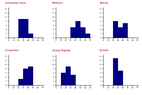
SharpPlot sp = new SharpPlot;

sp.SplitBy(_barleyfarm);  // One cell per farm

sp.HistogramStyle = HistogramStyles.SurfaceShading;
sp.ClassInterval = 10;
sp.SetXRange(0,70);
sp.SetYRange(14);

sp.SetCaptionFont("Arial",14,FontStyle.Bold,Color.Firebrick);
sp.DrawMultiple(ChartType.Histogram,_barleydata);
Worked Examples
 |
 |
 |
 |