| Professional charting tools for .Net developers |
Introducing SharpPlot
Your First Chart
Recent Updates
Tutorials
General Tutorials
Chart Tutorials
Reference
SharpPlot Class
Properties
Methods
Structures
Enumerations
Style examples
Glossaries
Active Charts
VectorMath Class
DBUtil Class
Get SharpPlot
Download SharpPlot
Buying SharpPlot
SharpPlot Support
Upgrading from GraPL
Release notes
Home > Sample Charts > MinMaxChart > Adding Errorbars to a ScatterPlot
Adding Errorbars to a ScatterPlot
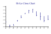
Some data series are best represented by their range at each time-value. This chart is also commonly used for stock-price data where the daily high and low may be combined with opening and closing values to produce a wide variety of typical ‘Wall Street Journal’ plots of the market data.
Experimental data may have errors on the y-dimension, the x-dimension or both. This chart is very similar to the Hi-Lo plot, but uses two MinMax charts to show errors in both X and Y directions.
Note that the scatter is typically the last chart to be drawn, so that the errorbars set the Y-axis range. If the X-errors are very large it may be necessary to set the X-axis range explicitly here. Plotting the data last also has the effect of placing the markers on top of the errorbars, which looks much cleaner.
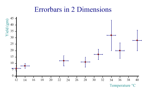
SharpPlot sp = new SharpPlot;

yield = new int[] {6,8,12,11,17,32,20,28};
temp = new int[] {12,14,23,28,31,34,36,40};
error = new int[] {2,2,4,4,4,12,6,8};

sp.Heading = "Errorbars in 2 Dimensions";
sp.XCaption = "Temperature °C";
sp.YCaption = "Yield (gm)";

sp.SetColors(new Color[]{Color.Navy,Color.Navy,Color.Maroon});
sp.MinMaxChartStyle = MinMaxChartStyles.ErrorBars;
sp.DrawMinMaxChart(AE.Plus(yield,error),AE.Minus(yield,error),temp);

sp.MinMaxChartStyle = MinMaxChartStyles.ErrorBars|MinMaxChartStyles.Horizontal;
sp.DrawMinMaxChart(AE.Plus(temp,1),AE.Minus(temp,1),yield);

sp.SetMarkers(Marker.Bullet);

sp.DrawScatterPlot(yield,temp);
Worked Examples
 |
 |
 |
 |