| Professional charting tools for .Net developers |
Introducing SharpPlot
Your First Chart
Recent Updates
Tutorials
General Tutorials
Chart Tutorials
Reference
SharpPlot Class
Properties
Methods
Structures
Enumerations
Style examples
Glossaries
Active Charts
VectorMath Class
DBUtil Class
Get SharpPlot
Download SharpPlot
Buying SharpPlot
SharpPlot Support
Upgrading from GraPL
Release notes
Home > Sample Charts > MinMaxChart > Using Envelope Fill as a Backcloth
Using Envelope Fill as a Backcloth
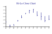
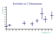
Some data series are best represented by their range at each time-value. Temperature data is typical – here the most informative chart shows the maximum and minimum values by day, with the range drawn as a vertical line. This chart is also commonly used for stock-price data where the daily high and low may be combined with opening and closing values to produce a wide variety of typical ‘Wall Street Journal’ plots of the market data.
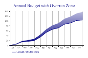
Another good use of this chart is to show increasing uncertainty into the future. This example shows a projected cumulative spending pattern, with an overrun zone to allow for ‘contingencies’ which cannot be planned for.
This could be used with financial data to show deviation from budget, or the movement of some key variable within its ‘allowed’ band. It could also show the confidence limits around a modelfit or economic forecast.

SharpPlot sp = new SharpPlot;

sp.Heading = "Annual Budget with Overrun Zone";

budget = new int[] {0,5,15,17,20,34,53,66,72,87,92,102,104};
bmax = new int[] {0,6,18,22,27,44,66,82,91,109,118,131,137};
xdata = new int[] {0,1,2,3,4,5,6,7,8,9,10,11,12};

sp.XAxisStyle = XAxisStyles.GridLines|XAxisStyles.MiddleLabels|XAxisStyles.ForceZero;
sp.SetXLabels(new string[]{"Jan","Feb","Mar","Apr","May","Jun","Jul","Aug","Sep",
         "Oct","Nov","Dec"});

sp.SetColors(Color.Navy);
sp.MinMaxChartStyle = MinMaxChartStyles.Envelope|MinMaxChartStyles.NoLines;
sp.SetFillStyles(FillStyle.GradientBottom);

sp.DrawMinMaxChart(budget,bmax,xdata);

sp.SetPenWidths(2);
sp.DrawLineGraph(budget,xdata);
sp.SetKeyText(new string[]{"","Cumulative budget spend"});
Worked Examples
 |
 |
 |
 |