| Professional charting tools for .Net developers |
Introducing SharpPlot
Your First Chart
Recent Updates
Tutorials
General Tutorials
Chart Tutorials
Reference
SharpPlot Class
Properties
Methods
Structures
Enumerations
Style examples
Glossaries
Active Charts
VectorMath Class
DBUtil Class
Get SharpPlot
Download SharpPlot
Buying SharpPlot
SharpPlot Support
Upgrading from GraPL
Release notes
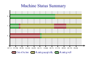
Home > Sample Charts > GanttChart > Using the barwidths to show resources
Using the barwidths to show resources
Gantt charts were originally devised as a graphical way to show the relationship between activites in a project plan, and have been made very popular by tools such as MS Project. The chart shows time progressing from left to right, with each activity drawn as a colored bar, and generally labelled with its name. The third variation on this basic chart uses the widths of each bar to indicate the number of people on site for each phase.
This time the bars have been labelled inside – be sure there is enough space for the labels if you choose to do this with real data. The widths are given in terms of the Y-scale, so typically the largest bar should be scaled to around 1 unit here.
Note the use of an XZone to indicate a particular period of time – probably a holiday week. You can set an array of zone definitions here to mark out several time intervals if required.
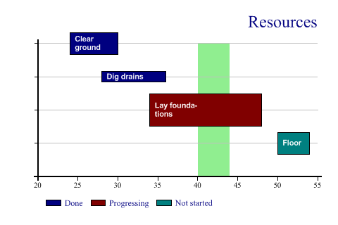
SharpPlot sp = new SharpPlot;

sp.Heading = "Resources";
sp.HeadingStyle = HeadingStyles.Right;
todo = new string[]{"Clear ground","Dig drains","Lay foundations","Floor"};
startwk = new int[] {24,28,34,50};
endwk = new int[] {30,36,48,54};
ydata = new int[] {4,3,2,1};
status = new string[]{"Done","Done","Progressing","Not started"};
resources = AE.Times(0.33,new int[] {2,1,3,2});
sp.SetValueFont("Arial",8,FontStyle.Bold,Color.White);
sp.SetValueTags(todo);
sp.ValueTagStyle = ValueTagStyles.Inside;
sp.ValueTagFormat = "XXXXXXXX;";
sp.GanttChartStyle = GanttChartStyles.ValueTags;
sp.YAxisStyle = YAxisStyles.ForceZero|YAxisStyles.GridLines|YAxisStyles.NoLabels;
sp.SetXTickMarks(5);
sp.SetXZones(new Zone(40,44,Color.LightGreen));
sp.SplitBy(status);
sp.SetBarWidths(resources);
sp.DrawGanttChart(ydata,startwk,endwk);
Worked Examples
 |
 |
 |
 |