| Professional charting tools for .Net developers |
Introducing SharpPlot
Your First Chart
Recent Updates
Tutorials
General Tutorials
Chart Tutorials
Reference
SharpPlot Class
Properties
Methods
Structures
Enumerations
Style examples
Glossaries
Active Charts
VectorMath Class
DBUtil Class
Get SharpPlot
Download SharpPlot
Buying SharpPlot
SharpPlot Support
Upgrading from GraPL
Release notes
Home > Sample Charts > Histogram > Grouping into Class Intervals
Grouping into Class Intervals
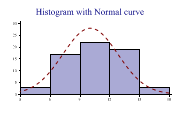
The Histogram does one very simple job – it takes a large sample of values and shows how they are grouped. Many samples of data turn out to follow a bell-shaped curve called the Normal distribution, but often the shape of the plot gives some useful clues which can be hidden simply by looking at statistics such as the Mean or Range.
This example aggregates the same (dice-throw) data into groups 2-4, 4-6 and so on. The groups are all labelled (including the groups with zero count, as this is perfectly valid data here).
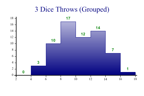
SharpPlot sp = new SharpPlot;

sp.Heading = "3 Dice Throws (Grouped)";
sp.HistogramStyle = HistogramStyles.SurfaceShading|HistogramStyles.ValueTags;
sp.SetFillStyles(FillStyle.GradientBottom);
sp.SetValueFont("Arial",10,FontStyle.Bold);

sp.SetXRange(3,18);
sp.ClassInterval = 2;
sp.SetXTickMarks(2);

sp.DrawHistogram(threedice);
Worked Examples
 |
 |
 |
 |