| Professional charting tools for .Net developers |
Introducing SharpPlot
Your First Chart
Recent Updates
Sample Charts
General Tutorials
Reference
SharpPlot Class
Properties
Methods
Structures
Enumerations
Style examples
Glossaries
Active Charts
VectorMath Class
DBUtil Class
Get SharpPlot
Download SharpPlot
Buying SharpPlot
SharpPlot Support
Upgrading from GraPL
Release notes
Tutorials > Chart Tutorials > Working with Barcharts
Working with Barcharts
The Barchart is probably the simplest and most commonly used graphic on the web. It is an ideal format for presenting summary data in multiple categories, and often works much better than a Piechart if the object is to allow the reader to compare values easily.
This short tutorial show 4 variations on a basic barchart, illustrating many of the common properties and styles of labelling that are available.
Grouped data in a vertical chart
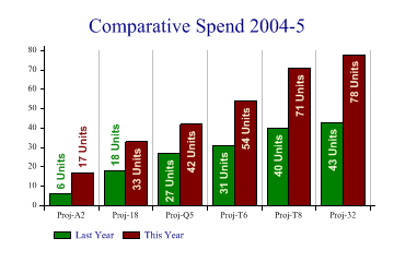
data = new int[][]{new int[]{6,18,27,31,40,43},new int[]{17,33,42,54,71,78}};

sp.Heading = "Comparative Spend 2004-5";
sp.BarChartStyle = BarChartStyles.TicksBetween|BarChartStyles.ValueTags|
         BarChartStyles.ForceZero;
sp.XAxisStyle = XAxisStyles.MiddleLabels|XAxisStyles.GridLines;

sp.ValueTagStyle = ValueTagStyles.Vertical|ValueTagStyles.Inside|
         ValueTagStyles.SectorValues|ValueTagStyles.RecolorOutside;
sp.SetValueFont("Arial",10,FontStyle.Bold,Color.LightYellow);
sp.ValueTagFormat = "###0 Units";

sp.Gap = 0;
sp.GroupGap = 0.5;
sp.SetColors(new Color[]{Color.Green,Color.Maroon});

sp.XLabelFormat = "Proj-XX";
sp.SetXLabels(new string[]{"A2","18","Q5","T6","T8","32"});
sp.SetKeyText(new string[]{"Last Year","This Year"});

sp.DrawBarChart(data);
This simple barchart illustrates several SharpPlot features which are designed to make the programmer’s life easy. Notice how the value-tags hop on top of the bars when they run out of space. In this case the ‘Recolor’ style has been used to have them take on the color of the bar (rather than white) when this happens.
The gap between bars (within each group) has been closed up completely, and the gap between groups reduced to half the width of one bar. By setting both gaps ‘relative to bar’ in this way, SharpPlot will adapt automatically to new data series with more or fewer bars.
Notice how the XLabelFormat has been used to expand slightly on the project identifiers used as labels.
Stacked bars, drawn horizontally
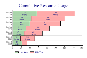
data = new int[][]{new int[]{21,18,27,31,40,43,56},new int[]{12,33,42,54,71,78,88}};

sp.Heading = "Cumulative Resource Usage";
sp.BarChartStyle = BarChartStyles.TicksBetween|BarChartStyles.ValueTags|
         BarChartStyles.ForceZero|BarChartStyles.Horizontal|
         BarChartStyles.StackedBars;
sp.YAxisStyle = YAxisStyles.MiddleLabels|YAxisStyles.GridLines|YAxisStyles.CenteredCaption;
sp.ValueTagStyle = ValueTagStyles.Middle|ValueTagStyles.SectorValues;
sp.SetValueFont("Arial",8,FontStyle.Bold,Color.DarkSlateBlue);
sp.ValueTagFormat = "###0\nUnits";

sp.Gap = 0;
sp.MarginLeft = 48;

sp.SetColors(new Color[]{Color.Green,Color.Red});
sp.SetFillStyles(FillStyle.Halftone);

sp.YLabelFormat = "Project\n#0000";  // Allows newlines here
sp.SetYLabels(new int[] {12,18,5,67,8,32});
sp.SetKeyText(new string[]{"Last Year","This Year"});

sp.DrawBarChart(data);
Bars, colored by category
This is a very typical political graphic, where a small amount of data must be clearly presented with consistent coloring.
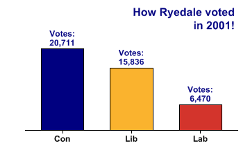
Party = new string[]{"Con","Lib","Lab"};
Vote2001 = new int[] {20711,15836,6470};

sp.SetMargins(42,48,36,18);
sp.Heading = "How Ryedale voted\nin 2001!";
sp.HeadingStyle = HeadingStyles.Right;

sp.SetHeadingFont("ARB",16,Color.Navy);
sp.SetValueFont("ARB",12,Color.Navy);
sp.SetLabelFont("ARB",12,Color.Black);

sp.SetColors(new Color[] {Color.Navy,ColorTranslator.FromHtml("#FAB32E"),
         ColorTranslator.FromHtml("#D3342C")});
sp.SetXLabels(Party);

sp.DataStyle = DataStyles.Rows;  // One series per value is required
sp.BarChartStyle = BarChartStyles.ValueTags;
sp.KeyStyle = KeyStyles.NoKey;

sp.ValueTagFormat = "Votes:\n##,###";
sp.YAxisStyle = YAxisStyles.NoAxis|YAxisStyles.ForceZero;
sp.DrawBarChart(Vote2001);
Horizontal, with ticks gridlines between bars
This chart of oil reserves is again designed for easy reading, and uses the horizontal style to allow space for the labels.
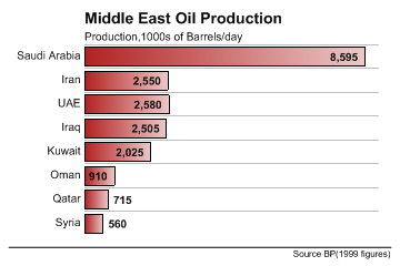
sp.SetBackground(Color.White,FillStyle.Solid);

country = new string[]{"Syria","Qatar","Oman","Kuwait","Iraq","UAE","Iran","Saudi Arabia"};
barrels = new int[] {560,715,910,2025,2505,2580,2550,8595};

sp.SetMargins(36,24,72,16);
sp.SetColors(Color.Firebrick);
sp.SetFillStyles(FillStyle.GradientLeft);

sp.BarChartStyle = BarChartStyles.Horizontal|BarChartStyles.ValueTags|
         BarChartStyles.TicksBetween;
sp.XAxisStyle = XAxisStyles.ForceZero|XAxisStyles.NoAxis;
sp.YAxisStyle = YAxisStyles.GridLines|YAxisStyles.MiddleLabels|YAxisStyles.InvisibleAxis;
sp.YTickStyle = YTickStyles.NoTicks;

sp.Gap = 0.3;

sp.SetLabelFont("Arial",10,Color.Black);

sp.SetValueFont("Arial",10,FontStyle.Bold,Color.Black);
sp.ValueTagFormat = "#,##0";
sp.ValueTagStyle = ValueTagStyles.Inside;

sp.Heading = "Middle East Oil Production";
sp.SetHeadingFont("ARB",14,Color.Black);
sp.HeadingStyle = HeadingStyles.Left;

sp.Subheading = "Production,1000s of Barrels/day";
sp.SetSubheadingFont("Arial",10,Color.Black);

sp.Footnote = "Source BP(1999 figures)";
sp.FootnoteStyle = FootnoteStyles.Right|FootnoteStyles.RuledAbove;
sp.SetFootnoteFont("Arial",8,Color.Black);

sp.SetYLabels(country);
sp.DrawBarChart(barrels);