| Professional charting tools for .Net developers |
Introducing SharpPlot
Your First Chart
Recent Updates
Tutorials
General Tutorials
Chart Tutorials
Reference
SharpPlot Class
Properties
Methods
Structures
Enumerations
Style examples
Glossaries
Active Charts
VectorMath Class
DBUtil Class
Get SharpPlot
Download SharpPlot
Buying SharpPlot
SharpPlot Support
Upgrading from GraPL
Release notes
Home > Sample Charts > DialChart > Two Warning Zones
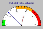
Two Warning Zones
The Dial or Gauge chart is often used to present a single value (maybe a benchmark index of company performance) in the context of an expected or desired range. The value on its own may mean very little (maybe our production plant made 23% rejects last week) until it is set in the context of the expected range.
This chart uses ‘annular’ zones (the default) to show two significant ranges in different colors. This gives a very clear indication of the health (or otherwise) of some key indicator of company performance.
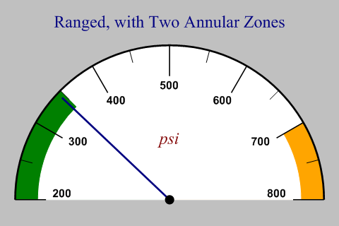
SharpPlot sp = new SharpPlot;
sp.SetMargins(24,24,12,12);

sp.Heading = "Ranged, with Two Annular Zones";
sp.SetAxisStyle(Color.Black,LineStyle.Solid,2);
sp.SetXLabelFont("Arial",12,FontStyle.Bold);

sp.SetPenWidths(2);
sp.SetBackground(Color.Silver,FillStyle.Solid);
sp.SetChartBackground(Color.White,FillStyle.Solid);
sp.SetXRange(200,800);
sp.SetXTickMarks(100,1);

xzones = new Zone[]{new Zone(200,350,Color.Green),new Zone(700,800,Color.Orange)};
sp.SetXZones(xzones);

sp.XCaption = "psi";
sp.SetXCaptionFont("times",18,FontStyle.Italic,Color.Maroon);

sp.DrawDialChart(345);
Worked Examples
 |
 |
 |
 |