| Professional charting tools for .Net developers |
Introducing SharpPlot
Your First Chart
Recent Updates
Sample Charts
General Tutorials
Reference
SharpPlot Class
Properties
Methods
Structures
Enumerations
Style examples
Glossaries
Active Charts
VectorMath Class
DBUtil Class
Get SharpPlot
Download SharpPlot
Buying SharpPlot
SharpPlot Support
Upgrading from GraPL
Release notes
Tutorials > Chart Tutorials > Using Venn diagrams
Using Venn diagrams
Venn diagrams are used to summarise set membership information. SharpPlot will draw a proportional diagram for two sets (and one intersection) but for the three set case the chart is purely diagrammatic, as it is impossible to scale all the regions in the correct proportion. Diagrams for higher numbers of sets are not supported.
A Simple 2-Area Diagram
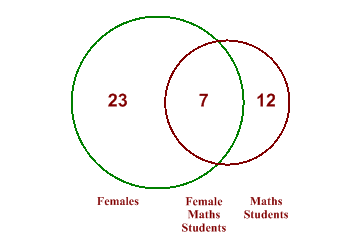
This is very typical of the type of data Venn diagrams are used for. We have a population of students, of which 12 study maths and 23 are girls. Of these, 7 study maths.

data = new int[] {23,12,7};
sp.SetMargins(12,48,0,0);
sp.VennDiagramStyle = VennDiagramStyles.ValueTags;
sp.SetValueFont("arial",18,FontStyle.Bold,Color.Maroon);

sp.SetColors(new Color[]{Color.Green,Color.Maroon});
sp.SetEdgeStyle(Color.Black,LineStyle.Solid,2);

sp.SetXLabels(new string[]{"Females","Maths Students","Female Maths Students"});
sp.SetXLabelFont("times",12,FontStyle.Bold,Color.Maroon);
sp.XLabelFormat = "XXXXXX;";

sp.DrawVennDiagram(data);
The two circles are drawn with their areas in proportion to the size of each group, and the centres are placed so that the area of overlap represents the number in the intersection.
Shading and Outlining
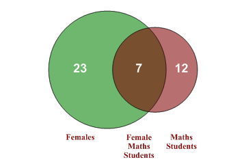
When you choose to fill the circles, SharpPlot picks a suitable opacity setting so that the colours combine effectively.

sp.SetMargins(12,48,0,0);
sp.VennDiagramStyle = VennDiagramStyles.Filled|VennDiagramStyles.RedrawOutline|
         VennDiagramStyles.ValueTags;
sp.SetValueFont("arial",18,FontStyle.Bold,Color.White);

sp.SetColors(new Color[]{Color.Green,Color.Maroon});
sp.SetXLabels(new string[]{"Females","Maths Students","Female Maths Students"});
sp.SetXLabelFont("times",12,FontStyle.Bold,Color.Maroon);
sp.XLabelFormat = "XXXXXX;";

sp.DrawVennDiagram(data);
In this example the outline of each circle is redrawn over the filled areas.
Combining Values and Labels
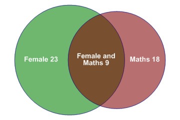
For a simple chart like this, it may be better to combine the text with the values and write everything into the circles. This has the advantage of saving space and allowing the chart to be drawn a little bigger.

data = new int[] {23,18,9};
sp.SetMargins(6,6,0,0);

sp.VennDiagramStyle = VennDiagramStyles.Filled|VennDiagramStyles.RedrawOutline|
         VennDiagramStyles.ValueTags;
sp.SetValueFont("arial",14,FontStyle.Bold,Color.White);
sp.ValueTagFormat = "XL #0";
sp.ValueLineSpacing = 100;
sp.SetColors(new Color[]{Color.Green,Color.Maroon});
sp.SetEdgeStyle(Color.Navy);
sp.SetXLabels(new string[]{"Female","Maths","Female and Maths"});
sp.XLabelFormat = "XXXXXXX;";

sp.DrawVennDiagram(data);
Note that the Value-tag format patches in the X-labels, and then the entire string is wrapped using the X-label format.
Three Areas
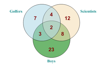
For the Three-area chart, it is essential to add the Value tags, as the size of the circles gives no clue to the number of members of each category.

data = AE.Join(new int[] {23,12,7},AE.Join(new int[] {8,4,3},2));
sp.SetMargins(12,12,6,6);

sp.VennDiagramStyle = VennDiagramStyles.Filled|VennDiagramStyles.RedrawOutline|
         VennDiagramStyles.ValueTags;

sp.SetValueFont("arial",18,FontStyle.Bold,Color.Maroon);

sp.ValueTagStyle = ValueTagStyles.Inside;
sp.ValueLineSpacing = 100;
sp.SetColors(new Color[]{Color.Green,Color.Wheat,Color.LightBlue});

sp.SetXLabels(new string[]{"Boys","Scientists","Golfers"});
sp.SetXLabelFont("times",14,FontStyle.Bold,Color.Teal);

sp.DrawVennDiagram(data);
Here we have 23 boys and 7 golfers. 3 of the boys play golf, and 2 of the golfing boys are scientists. For realistic data, some of the areas may have no members at all, but this does not affect the way the diagram is drawn.
Summary
The Venn diagram is a very special-purpose chart, and would normally be used for illustration rather than serious data-analysis. Charts with more circles have many more possibly intersections, and are almost impossible to draw in a way which provides any useful information to the reader. For the moment, SharpPlot limits you to the simple cases.