| Professional charting tools for .Net developers |
Introducing SharpPlot
Your First Chart
Recent Updates
Sample Charts
General Tutorials
Reference
SharpPlot Class
Properties
Methods
Structures
Enumerations
Style examples
Glossaries
Active Charts
VectorMath Class
DBUtil Class
Get SharpPlot
Download SharpPlot
Buying SharpPlot
SharpPlot Support
Upgrading from GraPL
Release notes
Tutorials > Chart Tutorials > Working with Linegraphs and Timeseries
Working with Linegraphs and Timeseries
Although it is called ‘Linegraph’ this SharpPlot method can do markers, risers from the X-axis, filled surfaces and so on, in any combination. Typically it is used for timeseries data, but of course it can also draw any continuous curve when given x as well as y co-ordinates.
A Typical Timeseries with Averaging
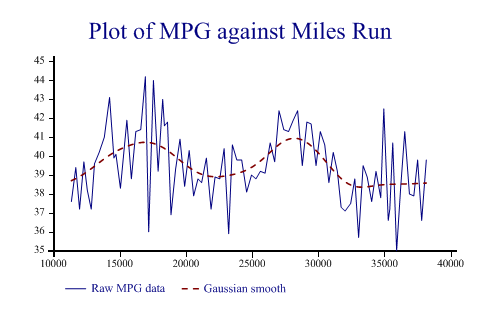
SharpPlot offers several ways to smooth a typically noisy timeseries. You can use the ‘Trend’ style to add a gaussian-weighted moving average or you can use any combination of traditional smoothing methods. This example has the results of monitoring the fuel consumption of a typical family car (measured in miles per gallon of fuel) which has plenty of random variation and some clear cycles (probably winter and summer).

odo = new int[] {11061,11354,11689,11975,12300,12558,12856,13100,13455,13841,14239,
         14571,14721,15058,15546,15886,16220,16592,16944,17192,17552,17906,18252,
         18381,18611,18876,19224,19558,19907,20252,20584,20914,21188,21549,21901,
         22204,22563,22890,23232,23510,23847,24214,24589,24954,25291,25627,25977,
         26366,26708,27030,27396,27753,28107,28437,28792,29136,29459,29831,30153,
         30487,30796,31127,31440,31722,32018,32442,32755,33045,33385,33689,34031,
         34355,34715,34944,35281,35398,35618,35915,36225,36526,36878,37212,37496,
         37805,38152};
mpg = new double[] {0,37.6,39.4,37.2,39.7,38.2,37.2,39.6,40.2,41,43.1,39.9,40.1,
         38.3,41.9,38.8,41.3,41.4,44.2,36,44,39.2,43,41.6,41.8,36.9,39.3,40.9,38.4,
         40.3,37.9,38.8,38.6,39.9,37.2,38.9,38.8,40.4,35.9,40.6,39.8,39.8,38.1,39,
         38.8,39.2,39.1,40.7,39.7,42.4,41.4,41.3,41.9,42.4,39.5,41.8,41.7,39.5,41.3,
         40.6,38.6,40.2,39.2,37.3,37.1,37.5,38.8,35.7,39.5,38.9,37.6,39.2,37.8,42.5,
         36.6,37.2,40.7,35,38.4,41.3,38,37.9,39.8,36.6,39.8};

sp.Heading = "Plot of MPG against Miles Run";
sp.SetXTickMarks(5000);
sp.LineGraphStyle = LineGraphStyles.TrendLine|LineGraphStyles.OnTopModel;
sp.Flexibility = 5;
sp.MissingValue = 0;
sp.SetLineStyles(new LineStyle[]{LineStyle.Solid,LineStyle.Dash});
sp.SetPenWidths(new double[] {0.8,1.2});

sp.DrawLineGraph(mpg,odo);  // SharpPlot.DrawLineGraph

sp.SetKeyText(new string[]{"Raw MPG data","Gaussian smooth"});
Note that the very first value is a ‘dud’ and is removed from the plot by setting it as ‘missing data’. In this case the fitted curve has been emphasised over the raw series by drawing it with a heavier line, on top of the data.
Of course you may have your own routines to compute more sophisticated curves and just add them to the chart with more calls to DrawLineGraph. A typical trick used when monitoring market data is to plot several moving averages and look for the point where they cross.
Mountain-range shading
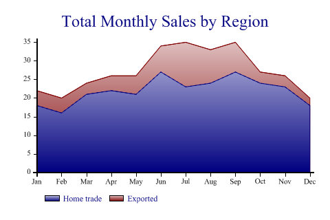
Sometimes it is best to show the accumulated values of several series as a stack of shaded surfaces. SharpPlot will accumulate the series for you and shade the surfaces if required.

sp.Heading = "Total Monthly Sales by Region";

home = new int[] {18,16,21,22,21,27,23,24,27,24,23,18};
export = new int[] {4,4,3,4,5,7,12,9,8,3,3,2};
months = new int[] {1,2,3,4,5,6,7,8,9,10,11,12};

sp.LineGraphStyle = LineGraphStyles.SurfaceShading;
sp.DataStyle = DataStyles.Relative;
sp.YAxisStyle = YAxisStyles.ForceZero;
sp.SetXLabels(new string[]{"Jan","Feb","Mar","Apr","May","Jun","Jul","Aug","Sep",
         "Oct","Nov","Dec"});

sp.SetFillStyles(FillStyle.GradientBottom);
sp.SetPenWidths(0.1);

sp.DrawLineGraph(new int[][]{home,export},months);  // SharpPlot.DrawLineGraph
sp.SetKeyText(new string[]{"Home trade","Exported"});
Note that any gradient fills are defined on the entire plotting region, so will always be consistently applied regardless of the range of the data. Clearly, you must pass all the series in the same call to have SharpPlot accumulate them for you in this way.
Drawing a Line given both x and y values
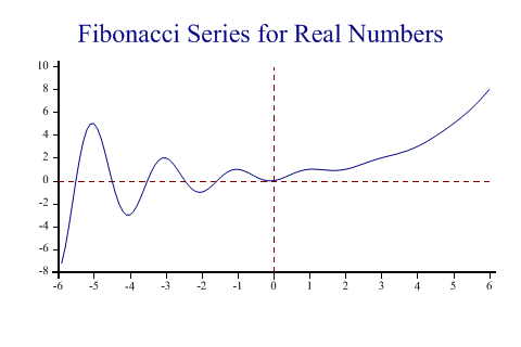
This example illustrates a mathematical curve, with computed x and y values. The ‘curves’ style also works well for examples like this, as many fewer intermediate points are required to give a pleasing result.

sp.Heading = "Fibonacci Series for Real Numbers";

ydata = FibFn(xdata);

sp.SetXDatumLines(0);
sp.SetYDatumLines(0);

sp.DrawLineGraph(ydata,xdata);
It is called a Fibonacci spiral, and cuts the x-axis at the classic Fibonacci series values of 1 1 2 3 5 8 and so on.
The Playfair Plot
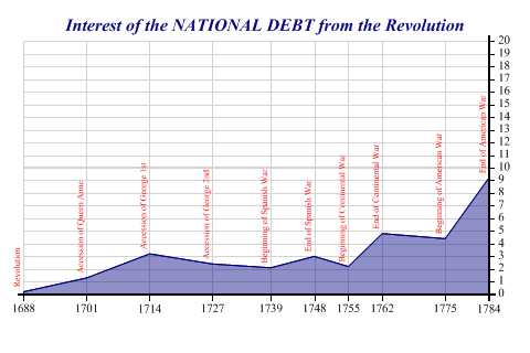
This chart (quoted in Tufte’s first book) was first used in 1760 to show the rising national debt in England. There are quite a lot of properties to set here, but it is tedious rather than hard, to get the feel of the original graphic.

years = new int[] {1688,1701,1714,1727,1739,1748,1755,1762,1775,1784};
debt = new double[] {0.2,1.3,3.2,2.4,2.1,3,2.2,4.8,4.4,9.2};

sp.LineGraphStyle = LineGraphStyles.SurfaceShading|LineGraphStyles.ValueTags;
sp.SetMargins(24,36,12,24);
sp.XAxisStyle = XAxisStyles.GridLines;
sp.YAxisStyle = YAxisStyles.GridLines|YAxisStyles.RightAxis;
sp.SetHeadingFont("times",12,(FontStyle.Bold|FontStyle.Italic));
sp.SetGridLineStyle(Color.LightGray,LineStyle.Solid,0.3);
sp.SetDatumLineStyle(Color.LightGray,LineStyle.Solid,1.5);
sp.SetXTickMarks(years);
sp.SetYRange(20);
sp.SetYTickMarks(1);
sp.SetFillStyles(FillStyle.Opacity42);
sp.Heading = "Interest of the NATIONAL DEBT from the Revolution";
sp.SetYDatumLines(10);

vtags = new string[]{"Revolution","Accession of Queen Anne",
         "Accession of George 1st","Accession of George 2nd",
         "Beginning of Spanish War","End of Spanish War",
         "Beginning of Continental War","End of Continental War",
         "Beginning of American War","End of American War"};

sp.SetValueTags(vtags);
sp.SetValueFont("Times",6,FontStyle.Regular,Color.Red);
sp.ValueTagStyle = ValueTagStyles.Vertical;

sp.DrawLineGraph(debt,years);
The most interesting design feature is the x-tick spacing where significant historical dates have been used to mark the years. The Y-axis is intentionally over-scaled to reduce the political impact of the graphic! Playfair’s first draft of this chart was much more dramatic. Opacity is used to give the effect of a water-color wash as used in the original drawing.
Summary
The Linegraph is by far the most versatile plotting method offered by the SharpPlot library, and is definitely the most widely used. It can be used in combination with any other 2D chart type to add extra lines and decorations as well as being a plotting tool in its own right.