| Professional charting tools for .Net developers |
Introducing SharpPlot
Your First Chart
Recent Updates
Sample Charts
Chart Tutorials
Reference
SharpPlot Class
Properties
Methods
Structures
Enumerations
Style examples
Glossaries
Active Charts
VectorMath Class
DBUtil Class
Get SharpPlot
Download SharpPlot
Buying SharpPlot
SharpPlot Support
Upgrading from GraPL
Release notes
Tutorials > General Tutorials > Grouping and Splitting Database Data
Grouping and Splitting Database Data
Many aggregations can be done very easily in SQL, and SharpPlot simply used to plot the group totals. The methods explored in this tutorial show you how to make more complex summaries and cross-tabs directly from the raw data series.
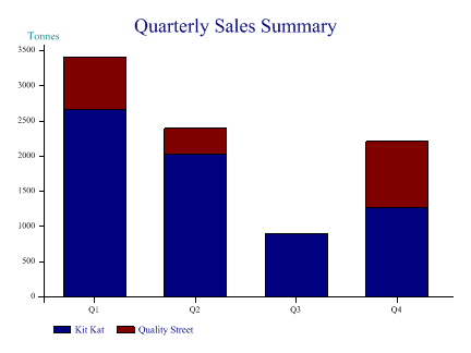
Grouped Barchart of Quarterly Sales
This example makes use of the DbUtil class to extract entire columns from a sample dataset (supplied as XML) and make a simple summary using grouping and splitting. Here is the finished chart and the complete source code to generate it:
// Simple example to show how we make a chart from a dataset
// Uses sample Sales.xml shipped with SharpPlot and the DbUtil class

using System;
using System.Data;
using Causeway;

class charttest
{
  static void Main()
  {
    SharpPlot sp = new SharpPlot();
    DataSet ds = new DataSet();

   // Initialise the dataset from the XML (schema is included)
    ds.ReadXml("Sales.xml");
    DataTable summary = ds.Tables[1];
    DataRow[] sel = summary.Select();  // All rows are fine here

    int[] col_sales = DbUtil.GetIntegers(sel,"Sales");
    string[] col_prodid = DbUtil.GetStrings(sel,"Product");
    string[] col_qtr = DbUtil.GetStrings(sel,"Quarter");

    sp.SplitBy(col_prodid); // One bar for each product
    sp.GroupBy(col_qtr);    // Accumulate quarters

    sp.BarChartStyle = BarChartStyles.ForceZero|BarChartStyles.StackedBars;
    sp.Heading = "Quarterly Sales Summary";
    sp.YCaption = "Tonnes";
    sp.YAxisStyle = YAxisStyles.AtEndCaption;

   // Use the product names for the keys (tables have the same ordering)
    sp.SetKeyText(DbUtil.GetStrings(ds.Tables[0].Select(),"Product Name"));

    sp.DrawBarChart(col_sales);

   // Save to SVG file
    sp.SaveSvg("dbdemo1.svg",SvgMode.FixedAspect);
  }
 }
Some things to note is the example:
- The first step is to make a selection from the table – in this case we just take all the rows in primary key sequence.
- Then we can pick out the required columns one by one – the data is returned as typed arrays
- SharpPlot can use the Quarters to aggregate the sales values, and the Product Ids to split them
- The Key text is set by default to the Ids used to split the data – here we override with the full product names.
With real data, you will probably have to take care to have the selections ordered correctly, but the basic principles should be very similar.
Plotting a Simple Timeseries (Share price data)
This example makes a comparative plot of two popular UK shares to get an idea which has performed better over the last three years. Note the formatting of the date column to obtain well-structured X-axis labelling.
The Date column should be retrieved as integers, which forces a conversion to OLEDate values